Sprite
Loading a sprite can be done using the optional sprite property at the root level of a MapTiler style.
A style’s sprite property supplies a template for loading small images to use in rendering background-pattern, fill-pattern, line-pattern,fill-extrusion-pattern and icon-image style properties.
Usage
You need to pass an URL where the sprite can be loaded from.
"sprite": "https://api.maptiler.com/maps/streets-v2/sprite"
This will load both an image by appending .png and the metadata about the sprite needed for loading by appending .json. For example:
- https://api.maptiler.com/maps/streets-v2/sprite.png
- https://api.maptiler.com/maps/streets-v2/sprite.json
Check out the details about the exact requirements on the format of these files is provided in the Sprite Source Format section.
When a sprite is provided, you can refer to the images in the sprite in other parts of the style sheet. For example, when creating a symbol layer with the layout property "icon-image": "museum". Or with the tokenized value "icon-image": "{icon}" and vector tile features with an icon property with the value museum.
Multiple Sprite Sources
You can also supply an array of { id: ..., url: ... } pairs to load multiple sprites:
"sprite": [
  {
    id: 'outdoor',
    url: 'https://api.maptiler.com/maps/outdoor-v2/sprite'
  },
  {
    id: 'winter',
    url: 'https://api.maptiler.com/maps/winter-v2/sprite'
  },
  {
    id: 'default',
    url: 'https://api.maptiler.com/maps/streets-v2/sprite'
  }
]
As you can see, each sprite has an id. All images contained within a sprite also have an id. When using multiple sprites, you need to prefix the id of the image with the id of the sprite it is contained within, followed by a colon. For example, to reference the campsite image on the roadsigns sprite, you would need to use outdoor:campsite.
The sprite with id default is special in that you do not need to prefix the images contained within it. For example, to reference the image with id airport in the default sprite above, you can simply use airport.
Sprite Source Format
A valid sprite source must supply two types of files:
-
An image file, which is a PNG images containing the sprite data.
-
An index file, which is a JSON document containing a description of each image contained in the sprite. The content of this file must be a JSON object whose keys form identifiers to be used as the values of the above style properties, and whose values are objects describing the dimensions (
widthandheightproperties) and pixel ratio (pixelRatio) of the image and its location within the sprite (xandy). For example, a sprite containing a single image might have the following index file contents:
{
    "poi": {
        "width": 32,
        "height": 32,
        "x": 0,
        "y": 0,
        "pixelRatio": 1
    }
}
Optional Properties
Apart from the required width, height, x, and y properties, the following optional properties are supported:
content: An array of four numbers, with the first two specifying the left, top corner, and the last two specifying the right, bottom corner. If present, and if the icon usesicon-text-fit, the symbol’s text will be fit inside the content box.stretchX: An array of two-element arrays, consisting of two numbers that represent the from position and the to position of areas that can be stretched.stretchY: Same asstretchX, but for the vertical dimension.sdf: Iftruethen the image is handled as a signed-distance field (SDF) and its color can be set at runtime using theicon-colorandicon-halo-colorproperties. Defaults tofalse.textFitWidth: TextFit enum of the value stretchOrShrink (or undefined), stretchOnly, proportional describing the behavior, horizontally, when scaling a sprite due to'icon-text-fit': 'both'.textFitHeight: Same astextFitWidthexcept vertically.
Stretch Properties
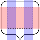
The following image gives a bit more information regarding the stretch properties:
{
    "sheild": {
        "width": 25,
        "height": 30,
        "x": 0,
        "y": 0,
        "stretchX": [[5, 10], [15, 20]]
        "stretchY": [[5, 20]]
        "pixelRatio": 1
    }
}
The red highlighted part is where the stretch will occur over the Y axis and the blue highlight is for the X axis.

Text Fit Properties
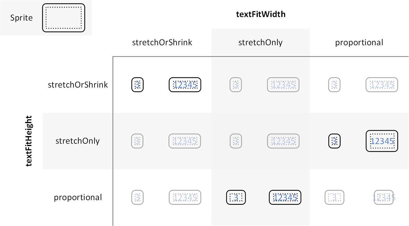
The properties textFitWidth and textFitHeight alter how a sprite’s content rectangle maps to its contents when scaling a sprite. These properties are defined with the enum TextFit which may have the following values:
stretchOrShrink(or omitted)stretchOnlyproportional
The primary use cases of interest are:
-
Both properties are undefined or stretchOrShrink
The content rectangle scales precisely to contain its contents.
-
textFitWidth = stretchOnly and textFitHeight = proportional
The content rectangle scales to precisely contain the height of its contents but the width will not shrink smaller than the aspect ratio of the original content rectangle. This is primarily useful for shields that shouldn’t become too narrow if their contents are narrow (like the number “1”).
-
textFitWidth = proportional and textFitHeight = stretchOnly
The content rectangle scales to precisely contain the width of its contents but the height will not shrink smaller than the aspect ratio of the original content rectangle. This may be useful scenarios like no. 2 except with vertically written scripts (using
"text-writing-mode": ["vertical"]).

High-DPI Devices
On high-DPI devices, @2x is appended to the URLs described above. For example, if you specified "sprite": "https://example.com/sprite", renderers would load https://example.com/sprite.json and https://example.com/sprite.png, or https://example.com/sprite@2x.json and https://example.com/sprite@2x.png.
Generating Sprites
There are tools that can generate sprites from SVG files, such as spreet and spritezero.
MapTiler map styles have their own sprites prepared by our cartographers. You can change the Icon’s fill color, outline, or size easily in the Map Designer tool. If you want to use your icons instead of the prepared icon sets, you can uploading your icons.
Read more about Using Sprites