Elevation Profile Control API reference
maptiler/maptiler-elevation-profile-control
The ElevationProfileControl creates a graphical component in your map application to show the elevation profile of any GeoJSON trace. This reference documents its every object and method available. Each section describes classes or objects as well as their properties, parameters, methods, and associated events. Many sections also include inline code examples and related resources.
Example (create control with some not default options)
Options
Parameters
| options.visible
default:
false |
If true, the elevation profile control will be visible as soon as it's ready.
If false, a click on the control button (or a programmatic call to
.showProfile()) will be necessary to show the profile.
|
|---|---|
| options.size
default:
"30%" |
Size of the profile as a CSS rule. This `size` will be the `width` if the `.position` is "left" or "right", and will be the `height` if the `.position` is "top" or "bottom". |
options.position
"top" |
"left" |
"right" |
"bottom"?
default:
"bottom" |
Position of the elevation profile chart when shown. |
| options.showButton
default:
true |
Show the control button. If can be handy to hide it, especially if the profile is displayed in a custom container and that its visibility is managed by logic external to this control. |
| options.containerClass
default:
"" |
A CSS class to add to the container. This is especially relevant when the options
.container is not provided.
⚠️ If provided, no styling is added by this control and even placement will
have to be managed by external CSS.
|
| options.container
default: automatically created inside the map container
|
DIV element to contain the control. ⚠️ If provided, no styling is added by this control. |
| options.backgroundColor
string |
null?
|
Color of the background of the chart |
options.unit
"metric" |
"imperial"?
default:
"metric" |
Unit system to use.
If "metric" , elevation and D+ will be in meters, distances will be in km.
If "imperial", elevation and D+ will be in feet, distances will be in miles.
|
| options.fontSize
default:
12 |
Font size applied to axes labels and tooltip. |
| options.forceComputeElevation
default:
false |
If true, will force the computation of the elevation
of the GeoJSON data provided to the .setData() method,
even if they already contain elevation (possibly from GPS while recording).
If false, the elevation will only
be computed if missing from the positions.
|
| options.displayElevationLabels
default:
true |
Display the elevation label along the vertical axis. |
| options.displayDistanceLabels
default:
true |
Display the distance labels along the horizontal axis. |
| options.displayUnits
default:
true |
Display the distance and elevation units alongside the labels. |
| options.labelColor
default:
"#0009"(partially transparent black) |
Color of the elevation and distance labels. |
| options.profileLineColor
string |
null?
default:
"#66ccff" |
Color of the elevation profile line.
Can be null to not display the line and rely on the background color only.
|
| options.profileLineWidth
default:
1.5 |
Width of the elevation profile line. |
| options.profileBackgroundColor
string |
null?
default:
"#66ccff22" |
Color of the elevation profile background (below the profile line)
Can be null to not display any background color.
|
| options.displayTooltip
default:
true |
Display the tooltip following the pointer. |
| options.tooltipTextColor
default:
"#fff" |
Color of the text inside the tooltip. |
| options.tooltipBackgroundColor
default:
"#000A"(partially transparent black) |
Color of the tooltip background. |
| options.tooltipDisplayDistance
default:
true |
Display the distance information inside the tooltip if true.
|
| options.tooltipDisplayElevation
default:
true |
Display the elevation information inside the tooltip if true.
|
| options.tooltipDisplayDPlus
default:
true |
Display the D+ (cumulated positive ascent) inside the tooltip if true.
|
| options.tooltipDisplayGrade
default:
true |
Display the slope grade in percentage inside the tooltip if true.
|
| options.displayDistanceGrid
default:
false |
Display the distance grid lines (vertical lines matching the distance labels) if true.
|
| options.displayElevationGrid
default:
true |
Display the elevation grid lines (horizontal lines matching the elevation labels) if true.
|
| options.distanceGridColor
default:
"#0001"(partially transparent black) |
Color of the distance grid lines. |
| options.elevationGridColor
default:
"#0001"(partially transparent black) |
Color of the elevation grid lines. |
| options.paddingTop
default:
30 |
Padding at the top of the chart, in number of pixels. |
| options.paddingBottom
default:
10 |
Padding at the bottom of the chart, in number of pixels. |
| options.paddingLeft
default:
10 |
Padding at the left of the chart, in number of pixels. |
| options.paddingRight
default:
10 |
Padding at the right of the chart, in number of pixels. |
| options.displayCrosshair
default:
true |
Display the crosshair, a vertical line that follows the pointer, if true.
|
| options.crosshairColor
default:
"#0005"(partially transparent black) |
Color of the crosshair. |
options.onChangeView
(windowedLineString: LineString) => void |
null?
default:
null |
Callback function to call when the chart is zoomed or panned.
The argument windowedLineString is the GeoJSON LineString
corresponding to the portion of the route visible in the elevation chart.
|
options.onClick
(data: CallbackData) => void |
null?
default:
null |
Callback function to call when the the elevation chart is clicked. |
options.onMove
(data: CallbackData) => void |
null?
default:
null |
Callback function to call when the pointer is moving on the elevation chart. |
CallbackData being:
Events
The control has three events available that we can define in the constructor options:
onMovewhen moving the pointer on top of the profileonClickwhen clicking on the profileonChangeViewwhen zooming or panning the profile
With the event onMove we can easily display a marker moving on top of the map. See the Elevation profile control show trace position
example.
With the event onChangeView, we can access a GeoJSON LineString corresponding to the zoomed section that we can then display on top of the full-length route. We can quickly achieve this with the Polyline Helper available in the MapTiler SDK. Check out the Elevation profile control show zoomed section example.

Styling
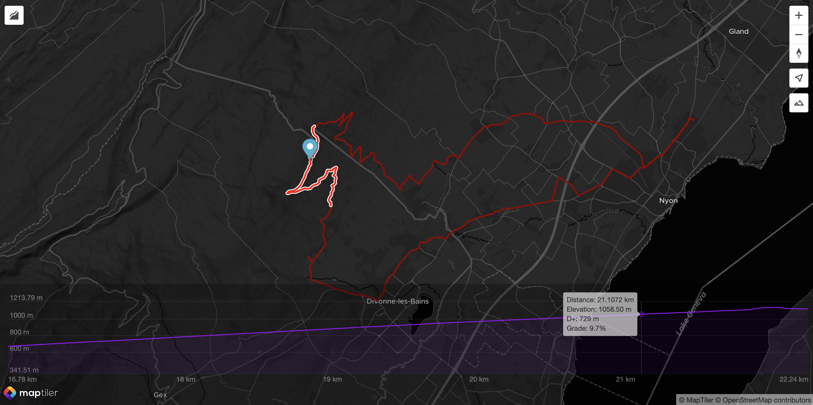
As with many MapTiler SDK JS controls, it is made available with a button on the map. By default, the elevation profile chart is displayed on the map. However, you can customize how you want to achieve that.
Control constructor styling options
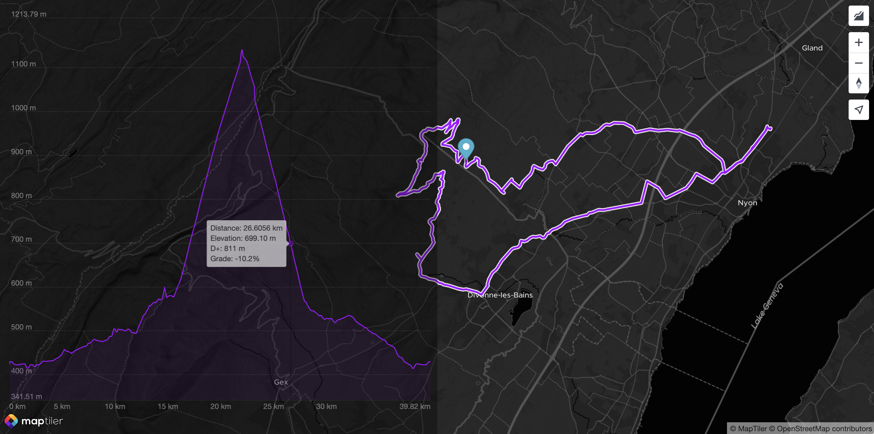
The following configuration makes the chart sticking to the left, partially transparent to reveal the map underneath:
const epc = new maptilerelevationprofilecontrol.ElevationProfileControl({
  visible: true, // no need to click, it's there by default
  position: "left",
  backgroundColor: "#0005",
  labelColor: "#FFF6",
  size: "50%", // Take half of the room available (default is 30%)
  elevationGridColor: "#FFF1",
  tooltipTextColor: "#000b",
  tooltipBackgroundColor: "#eeea",
  profileLineColor: "#a103fc",
  profileBackgroundColor: "#a103fc11",
});
Here is the result:

Control containerClass option
A second option to achieve even more custom styling is to use the option containerClass. This way, almost all the styling is performed at the application level (rather than internally by the control itself), yet the control still creates the container. Here is an example:
const epc = new maptilerelevationprofilecontrol.ElevationProfileControl({
  visible: true,
  // since the text is drawn in the canvas,
  // it still has to be tuned here:
  fontSize: 9,
  containerClass: "profileContainer",
});
Here is the profileContainer style definition in CSS:
@keyframes fadeIn {
  from { opacity: 0; }
  to { opacity: 1; }
}

.profileContainer {
  background-color: #fff;
  height: 200px;
  width: 60%;
  position: absolute;
  bottom: 0;
  left: 0;
  right: 0;
  border-radius: 3px;
  margin: 20px auto;
  filter: drop-shadow(0px 0px 15px #00000066);
  animation: fadeIn 0.5s ease forwards;
}
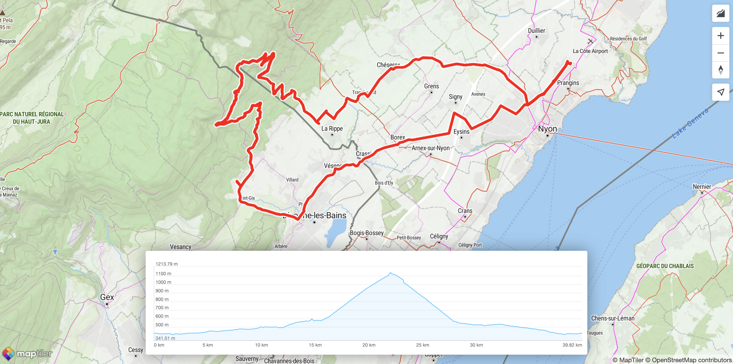
Here is the result:

Display the control in an external container
A third way to achieve customization with an even higher level of freedom is to use the container options. Instead of creating the container, the Control will use an existing one and not alter its container’s styling. Here is an example of how to achieve that:
const epc = new maptilerelevationprofilecontrol.ElevationProfileControl({
  unit: "imperial",
  container: "profileContainer",
  showButton: false,
  labelColor: "#FFF6",
  elevationGridColor: "#FFF1",
  tooltipTextColor: "#000b",
  tooltipBackgroundColor: "#eeea",
  profileLineColor: "#a103fc",
  profileBackgroundColor: "#a103fc11",
  crosshairColor: "#66f5",
  displayTooltip: true,
});
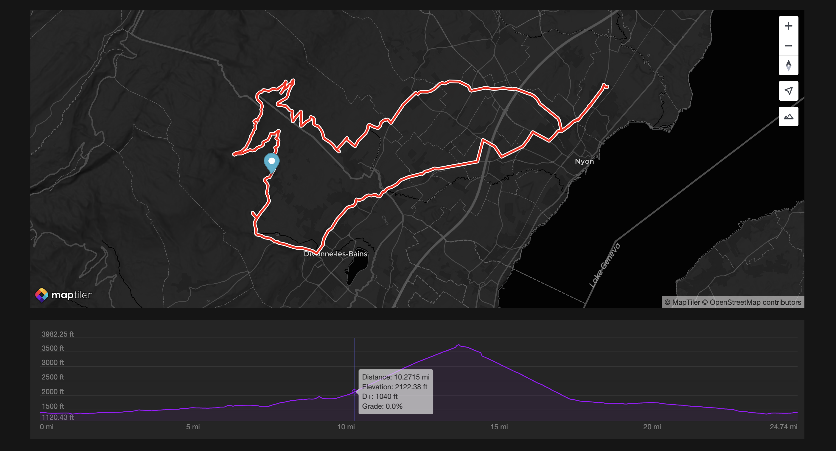
For a better-looking example, the example also comes with some custom colors. Here is how it looks like:

As you can see, the option showButton is false, and as a result, the control button is not showing on top of the map. This may be convenient in cases where the container is managed entirely at the application level.
Check out the Elevation profile control customized example.